Luxury Real Estate is defined not only by location, scale, and materials but also by the details that shape the atmosphere of a home. Among these details, color plays a pivotal role. While architecture lays the foundation and furnishings fill the space, Color provides emotion, cohesion, and style. As trends evolve, the annual Color of the Year interior design choice emerges as a critical tool for creating interiors that feel fresh, curated, and aligned with contemporary taste. For Homeowners and Real Estate professionals, incorporating this timely yet sophisticated design element can transform a property’s aesthetic and elevate its perceived value.
The Marcontell-Gilchrest Group, recognized for their expertise in luxury properties, often works with clients and designers to implement forward-thinking design choices that resonate with today’s Buyers. As interiors grow more experiential, leveraging the Color of the Year is a strategic decision that enhances both visual appeal and emotional resonance. This article explores how the color of the year influences luxury interior design and how its thoughtful integration can define and distinguish high-end real estate.
The Influence of the Color of the Year in High-End Homes
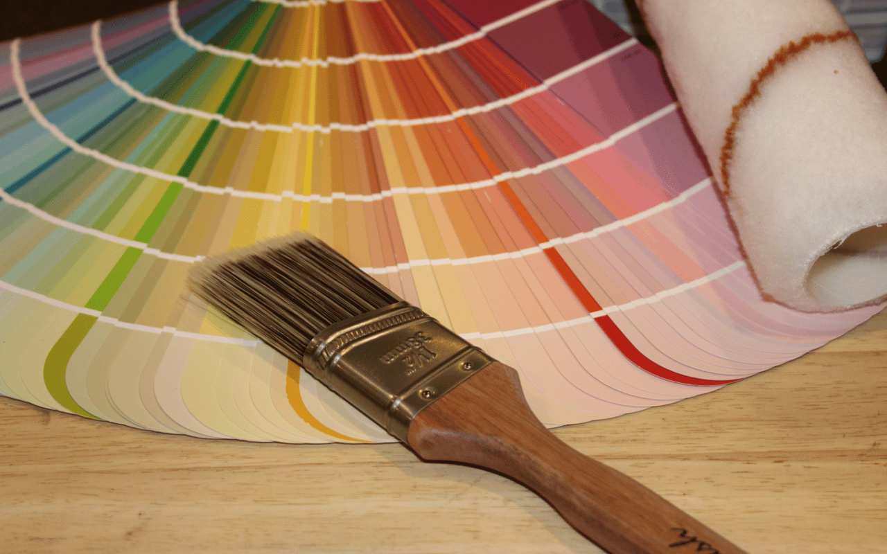
Each year, major color authorities like Pantone, Sherwin-Williams, and Benjamin Moore unveil a carefully selected hue that reflects current cultural movements, lifestyle trends, and emotional needs. These choices often ripple across industries—from fashion to technology—but perhaps nowhere are they more impactful than in home design. For luxury properties, where design is both personal and performative, the color of the year interior design trend sets the tone for sophisticated, intentional spaces.
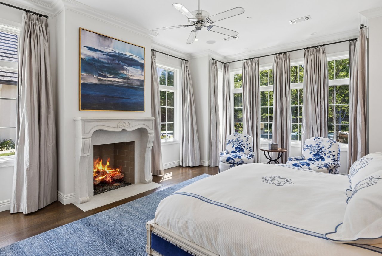
Color has the power to influence mood and spatial perception. When used correctly, the Color of the Year becomes more than just a trend—it becomes a versatile foundation that brings warmth, modernity, or serenity to a room. For example, if the Color of the Year is a muted terracotta or soft blush, it can be layered into drapery, accent walls, or upholstery to add earthiness and comfort. If the chosen shade is a vibrant teal or deep aubergine, it might be best used as a bold statement in an entryway or powder room.
In luxury homes, where every detail is curated to align with a lifestyle vision, color selection is never arbitrary. It communicates intentionality and reflects an understanding of contemporary aesthetics. Integrating the color of the year into interior design projects signals that a home is both stylish and thoughtfully designed—two key factors in attracting discerning buyers.
Applications of the Color of the Year in Interior Design
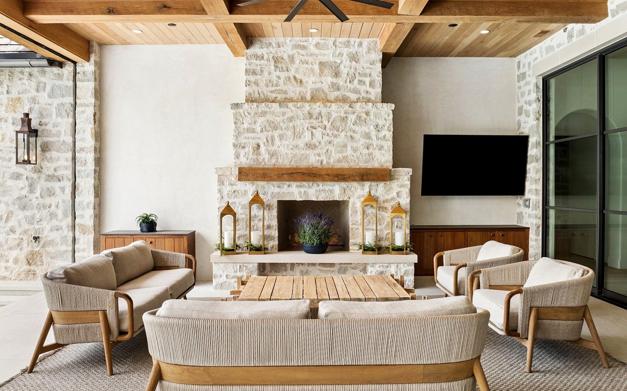
One of the most effective ways to incorporate the Color of the Year interior design element is through strategic layering. In high-end properties, this doesn’t mean flooding the space with a single hue, but rather using it to accentuate architectural features and guide the eye through the home. Designers and staging professionals might apply the Color of the Year in accent pillows, bespoke rugs, curated artwork, or ceramics. These subtle touches can refresh the space without overwhelming it.
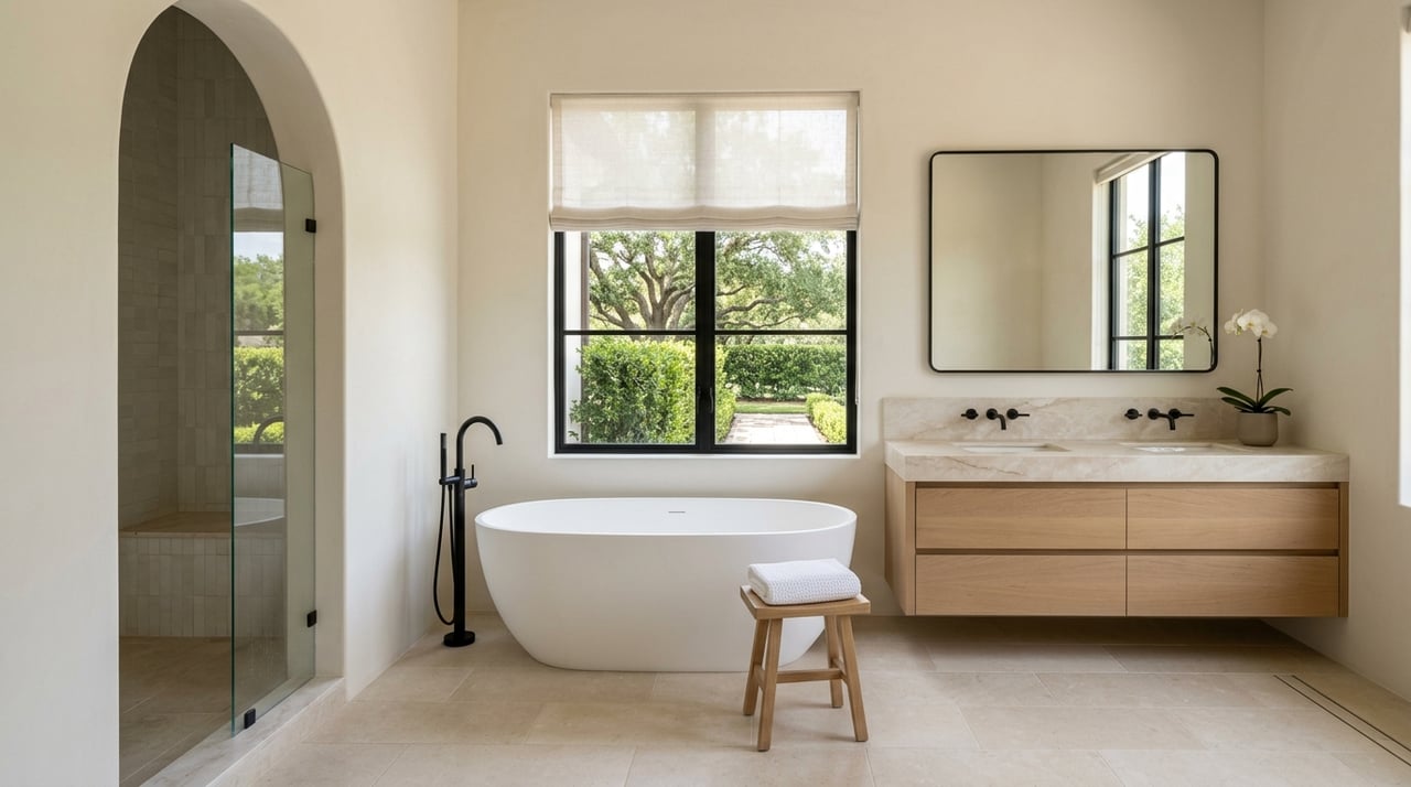
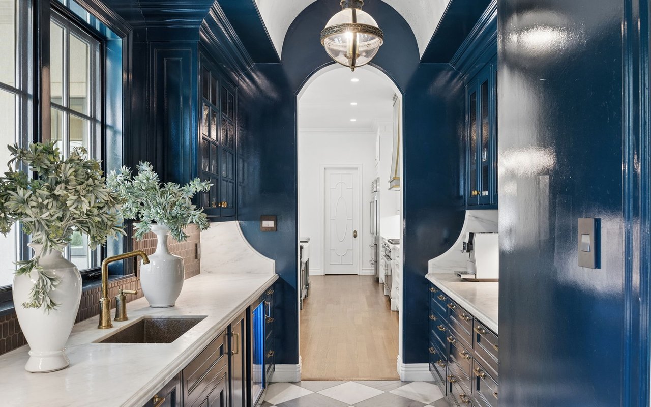
For homeowners undergoing more extensive renovations, the Color of the Year can be integrated into cabinetry, kitchen islands, wall paneling, or built-ins. In open-concept spaces, the color can be repeated in varying tones across adjacent rooms to create visual continuity. In bathrooms, it can be introduced through artisan tile, luxury towels, or painted vanities, adding depth and designer flair.
High-end buyers often expect a home to be current without feeling trendy. The Color of the Year, when applied thoughtfully, strikes that balance. It adds contemporary appeal while allowing the architectural bones and luxurious materials—such as marble, walnut, or brass—to remain the visual anchors.
Elevating Staging and Marketing With Color Strategy
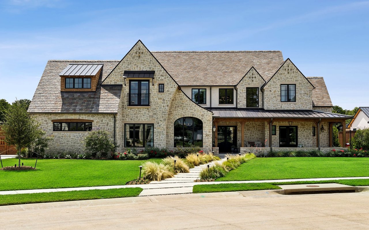
In today’s competitive Real Estate market, presentation is everything. For listings in the luxury tier, Buyers are drawn to homes that feel move-in ready and design-forward. Integrating the Color of the Year interior design concept into staging efforts can dramatically improve a property’s market appeal. These curated touches capture attention in listing photos, convey taste, and evoke the lifestyle many buyers aspire to.
Even modest updates like repainting a feature wall, switching out bedding, or upgrading accessories can make a home appear more elevated and turnkey. In Coconut Grove, Highland Park, or Houston’s Museum District—markets where architectural quality is a given—color becomes the variable that creates warmth, intimacy, and modern style.
Real Estate professionals working with design-savvy stagers can position a property more successfully by incorporating the latest color narratives. A thoughtfully chosen palette, especially one anchored by the color of the year, not only enhances visual appeal but also adds a layer of storytelling that helps buyers imagine life in the space.
Tailoring the Color of the Year to Regional Aesthetic Preferences
While the annual color selection is made with global trends in mind, its application should be tailored to the specific real estate market. For instance, homes in sunlit, coastal areas like South Florida might embrace lighter or more saturated tones of the Color of the Year to reflect the region’s vibrancy and natural beauty. Think of sage greens, ocean blues, or coral-inspired pinks used to echo the tropical surroundings while still aligning with broader design movements.
In contrast, homes in more urban or traditionally styled neighborhoods may adapt the color of the year in deeper, moodier tones. A charcoal-infused variant or dusty version of the chosen hue may feel more appropriate in a brownstone or contemporary penthouse.
This localized application ensures that the color of the year interior design strategy does not feel generic but rather customized to resonate with the expectations of a particular buyer pool. It bridges universal trends with regional character—an approach that elevates both design integrity and real estate value.
Longevity, Versatility, and Resale Considerations
A common concern among homeowners is whether incorporating the Color of the Year will lead to dated interiors. The key is to use the shade in ways that can be updated easily or that blend naturally with timeless design elements. Textiles, wall paint, and accent furniture are ideal vehicles for experimentation, allowing flexibility as styles evolve.
When used with restraint and balance, the Color of the Year interior design choice enhances a room’s character without committing to a single trend. It works especially well when paired with enduring neutrals—such as taupe, ivory, slate, or brushed gold—that create a flexible backdrop for seasonal or annual refreshes.
For resale purposes, incorporating the Color of the Year into moveable or easily replaceable design elements ensures that future buyers see a stylish home without the worry of needing immediate changes. This makes the home more marketable and positions it as a well-maintained, on-trend property in buyers’ minds.
Working With Professionals to Maximize Impact
Integrating the Color of the Year effectively requires collaboration between homeowners, designers, and real estate professionals. Luxury properties benefit from a tailored approach that considers the home’s architecture, lighting, layout, and market positioning. A professional designer or stager with knowledge of current color trends can offer strategic input that aligns aesthetics with emotional impact.
Agents from the Marcontell-Gilchrest Group often coordinate with design consultants to ensure that properties are positioned competitively and visually optimized for both in-person showings and digital listings. Color, when used as part of a broader design and marketing strategy, becomes a powerful tool in reinforcing a home’s luxury status and creating an emotional connection with buyers.
Incorporate the Color of the Year in Your Interior Design With Expert Real Estate Support
Whether you're preparing to list your home or simply updating your interiors for personal enjoyment, incorporating the Color of the Year interior design trend is a sophisticated way to infuse your home with modern elegance. By using this trend with purpose and restraint, homeowners can create a refined, cohesive look that speaks to today’s luxury lifestyle.
Contact Marcontell-Gilchrest Group today to explore how strategic design choices—including the Color of the Year—can elevate your home’s presentation and market value. With deep industry expertise and a design-conscious approach, Marcontell-Gilchrest Group offers a refined perspective on luxury real estate, helping clients make decisions that blend visual appeal with long-term investment value.